Enter the world
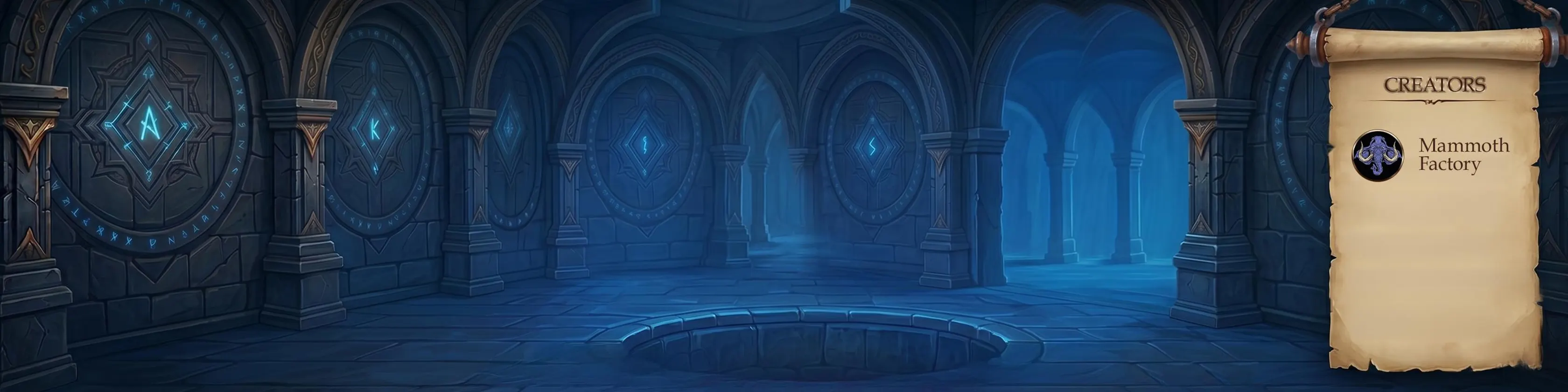
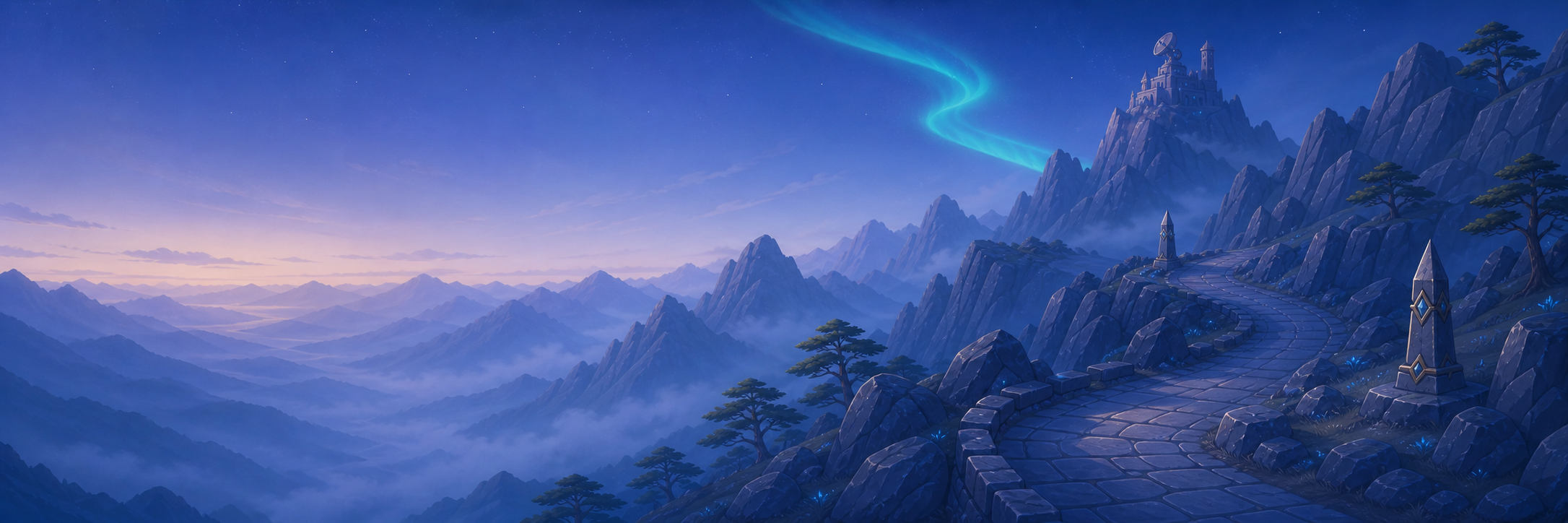
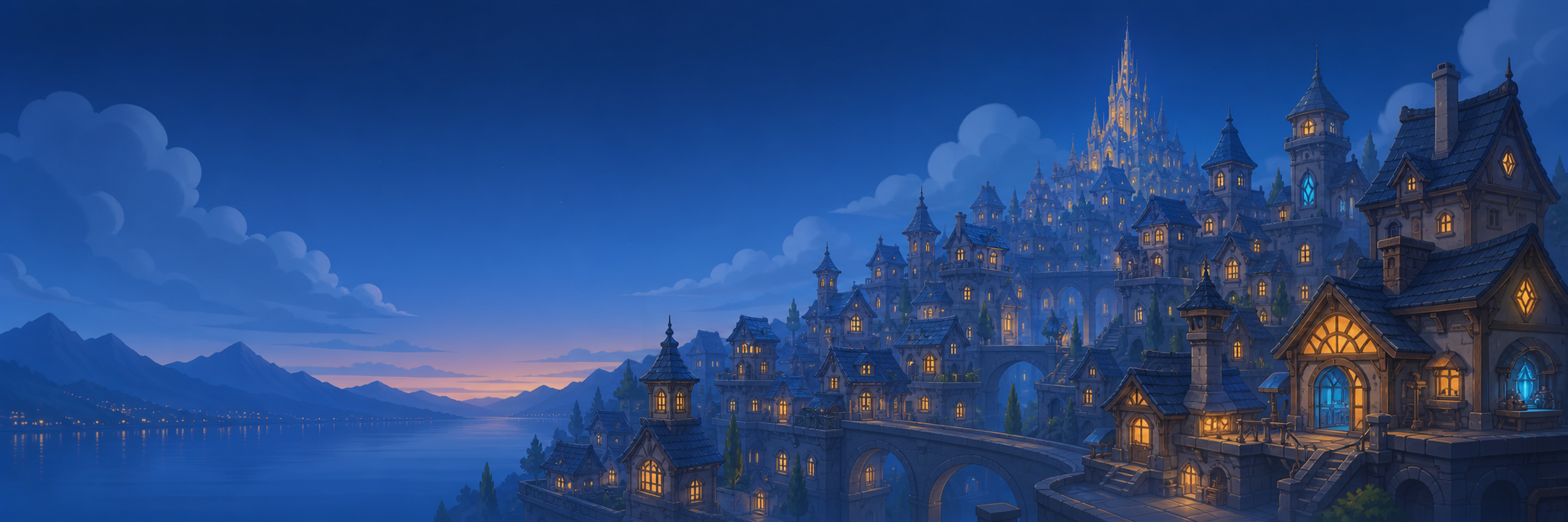
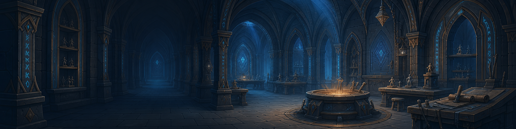
Dark environments, cinematic depth and one clear object. Use for shipping, launches, collections and immersive storytelling.
A premium tabletop fantasy identity balancing atmospheric worlds, maker-led warmth and a restrained mobile-game visual language.
Chamber of Creations moves between dark adventure and warm making. Both modes share the same navy, bronze, cyan and serif-led hierarchy, so the identity can change mood without losing recognition.
Dark environments, cinematic depth and one clear object. Use for shipping, launches, collections and immersive storytelling.
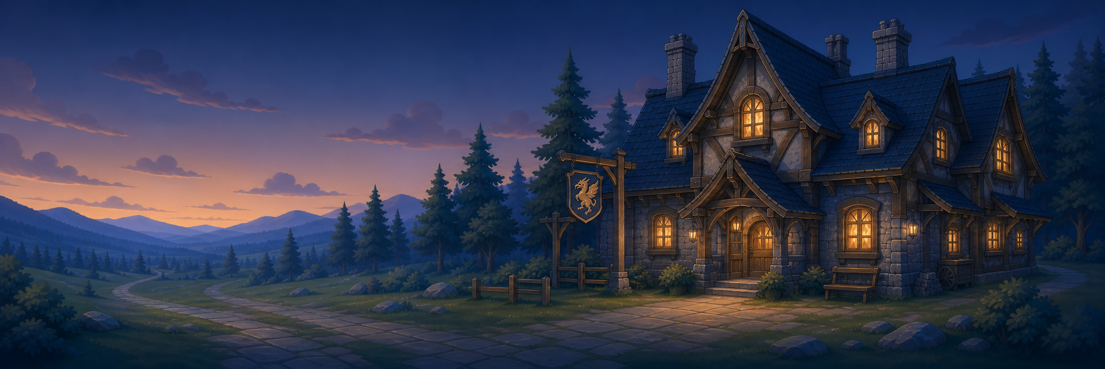
Warm stone or parchment, editorial typography and simplified bronze illustration. Use for gifts, process, instructions and creator stories.
Use the full-colour logo whenever possible. The monochrome versions are functional alternatives for high-contrast, single-colour or production-limited applications. Never rebuild the mark from UI pieces.


Navy creates the chamber, bronze carries the craft, parchment provides editorial space, and cyan marks only active magic. Violet is a rare narrative accent, not a default decoration.
#071522#1D2C3B#B88455#EFE0C0#48B9D7#62517CHero titles, campaigns, product names and collection covers.
Download Cinzel ↓Subheads, friendly messages, storytelling and longer descriptions.
Download Nunito ↓Buttons, prices, sizes, labels and technical details.
Download Inter ↓This is the production standard for campaign visuals. Start from these values, keep the relationships intact, and scale the complete system together for other canvas widths: new value = token × canvas width ÷ 1080.
More treasure. No extra travel fee. Clear, friendly supporting copy always follows the headline hierarchy.
18 px22 px+0.16 em24 px104 px94 px−0.025 em16 px68 px64 px−0.015 em40 px48 px48 px−0.015 em24 px24 px34 px0 em24 px20 px30 px0 em24 px18 px22 px+0.10 em16 px16 px22 px+0.02 em0 pxUse only these spacing increments. Avoid improvised gaps such as 19 px or 37 px.
A visual inventory from one shared world. Explore the complete system first, then filter the working library and download any transparent element individually.
Frames establish place. Objects carry story. Dividers and icons organise the message.
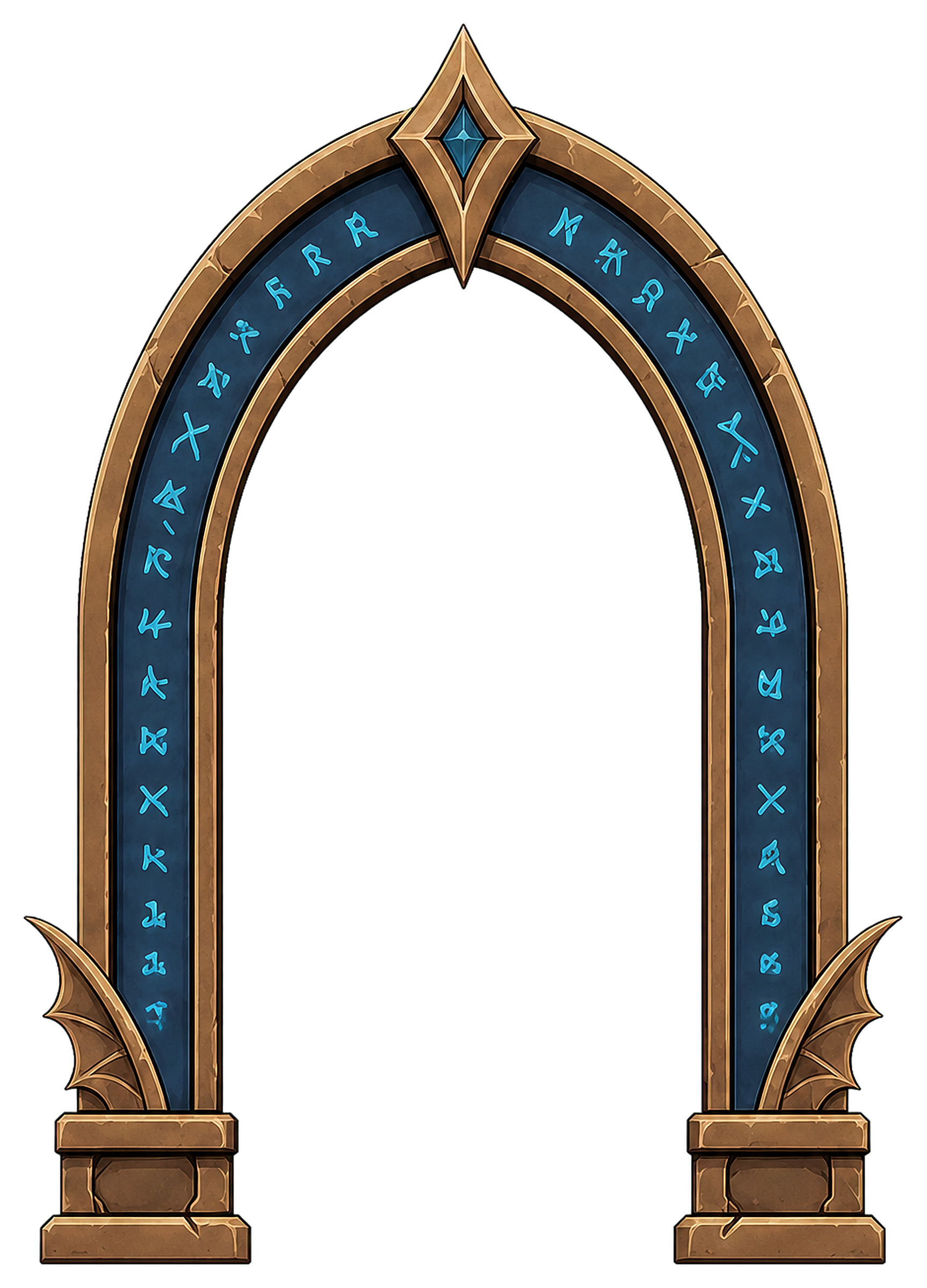
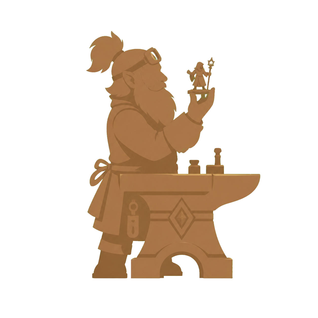

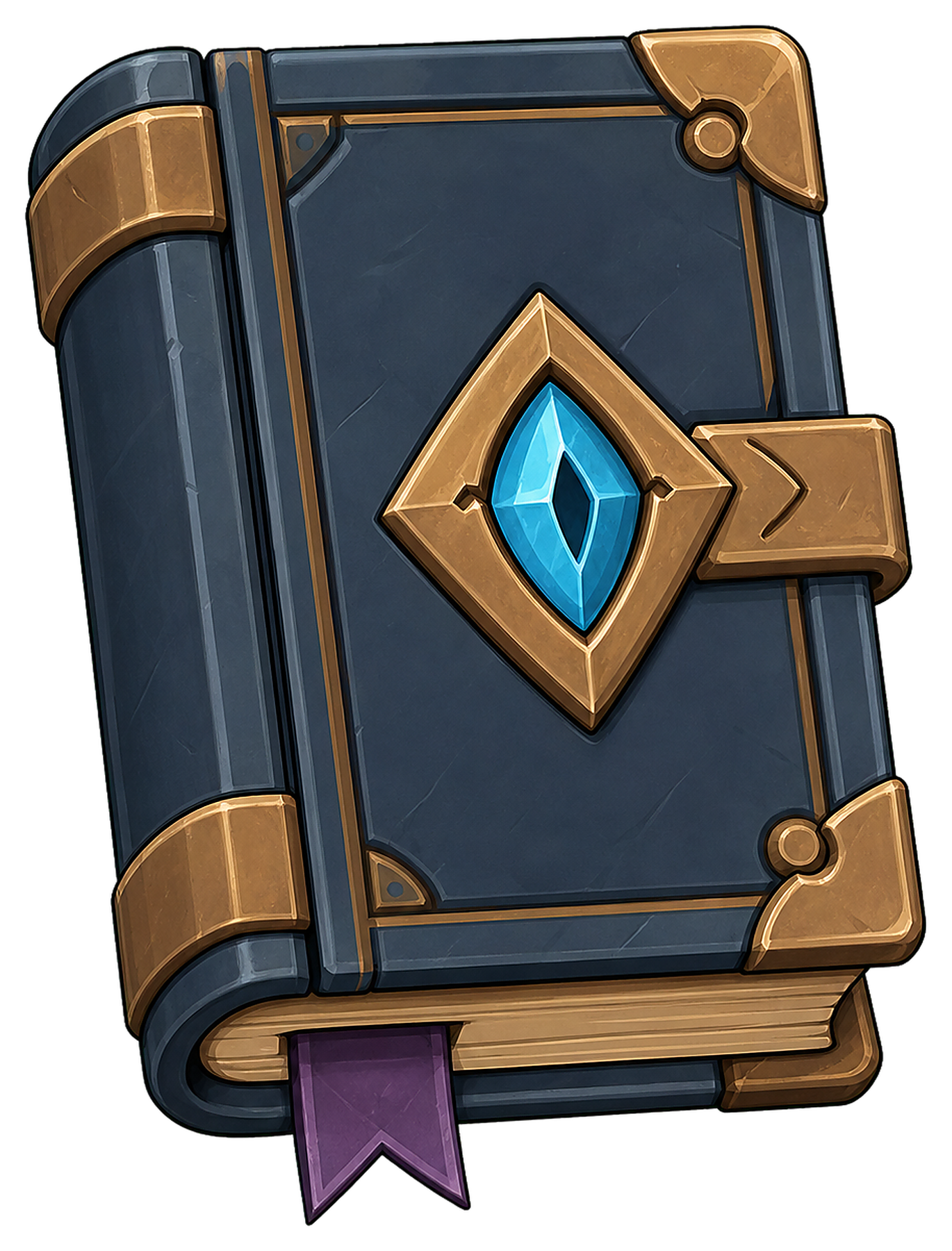
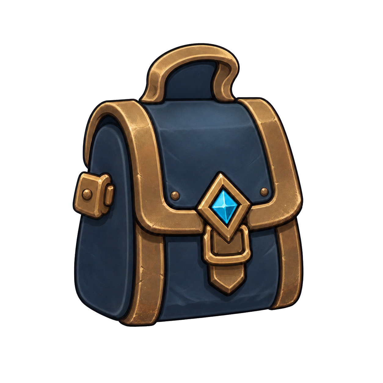




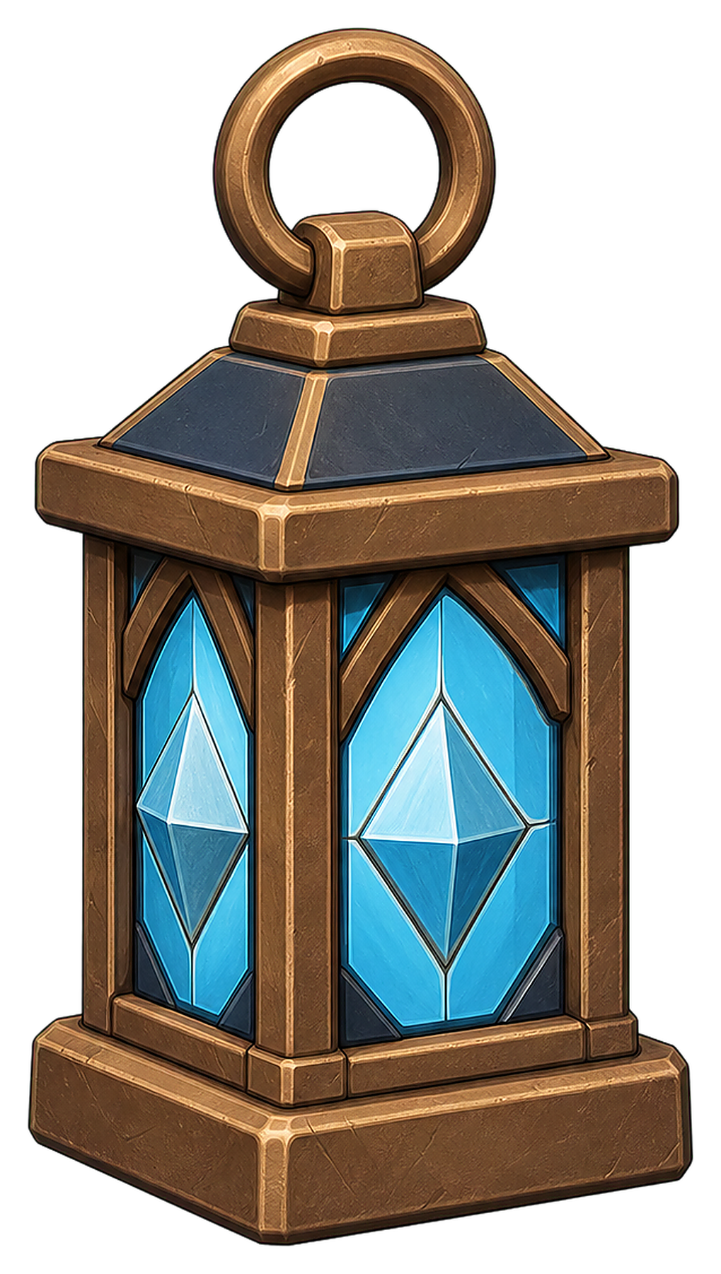

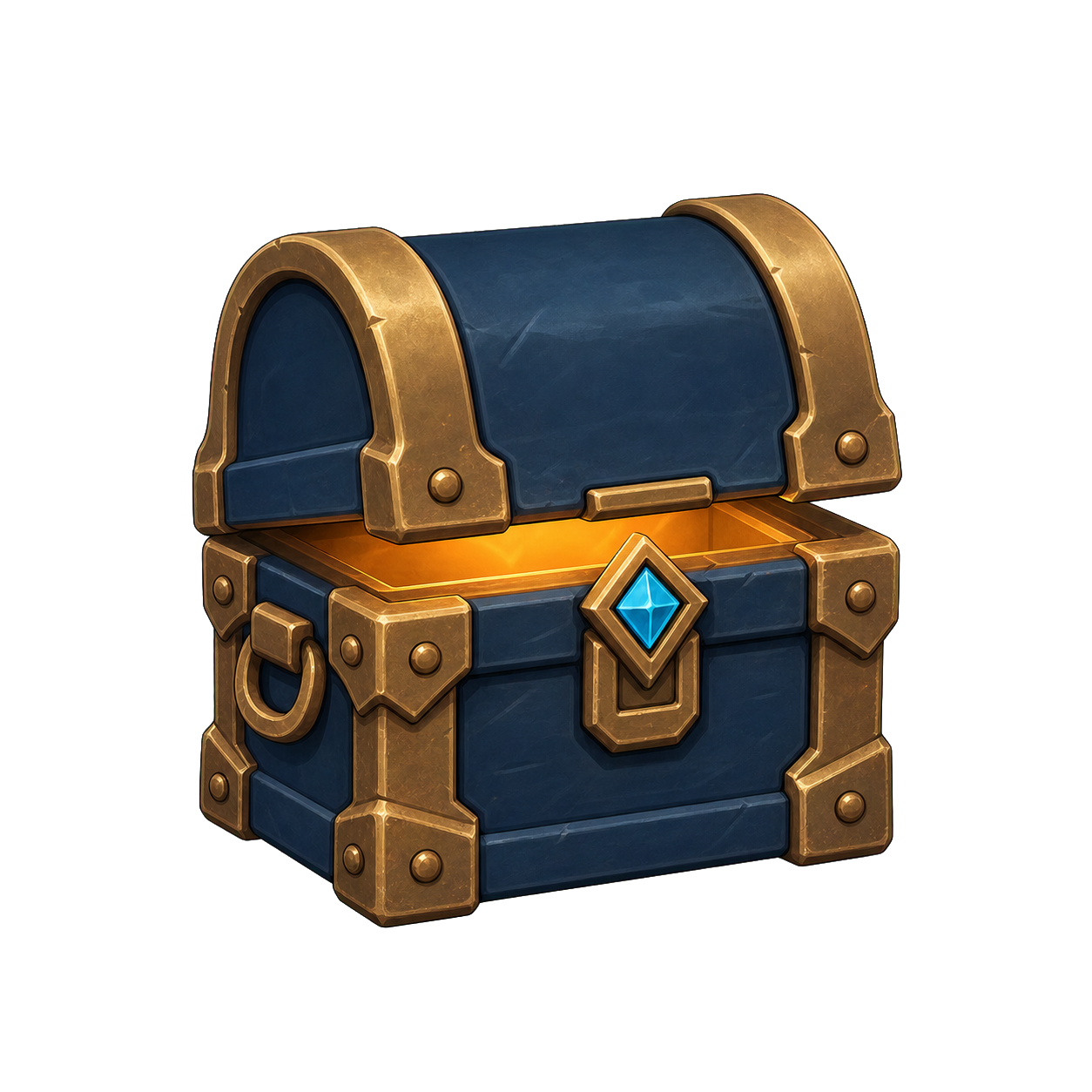
Use world backgrounds when the visual should feel like a scene. Use abstract surfaces when typography, product information or a single object must remain dominant.
These examples establish the correct hierarchy. Each has one dominant idea, generous negative space and only the UI required to clarify the message.
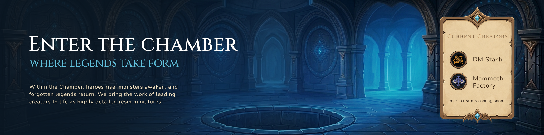
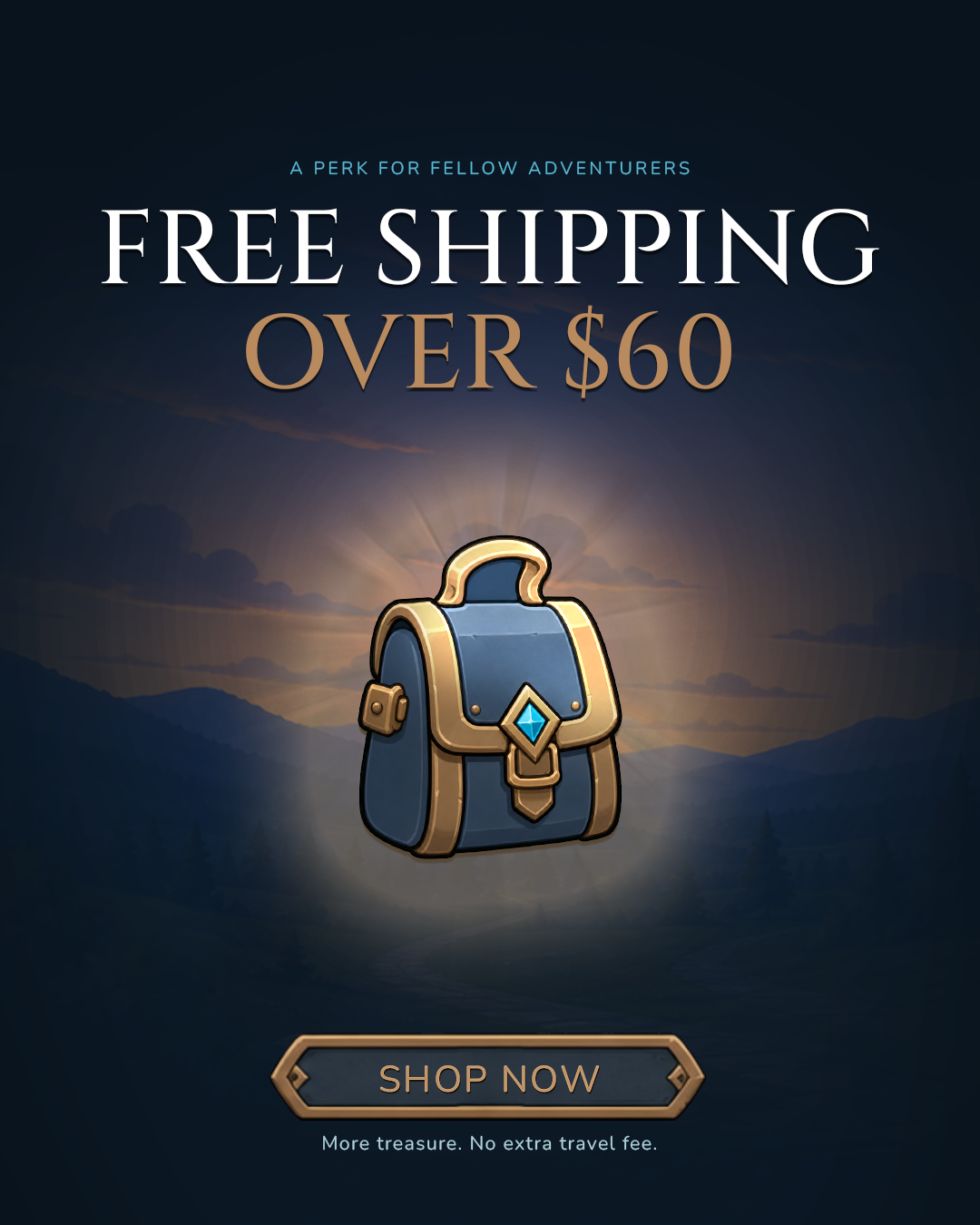
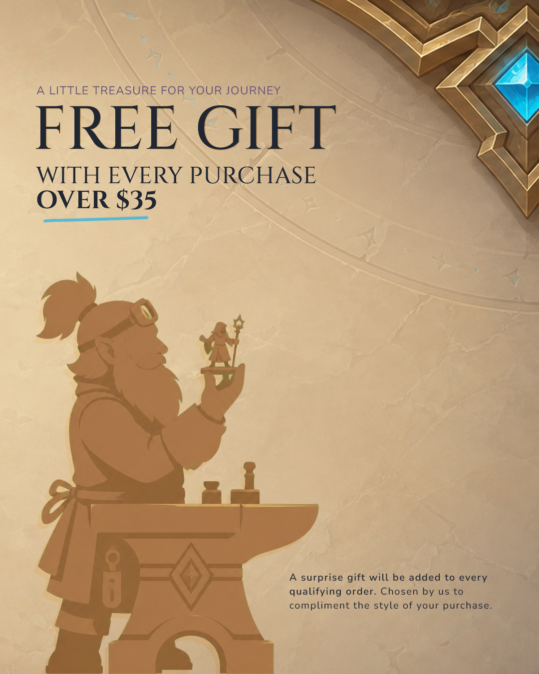
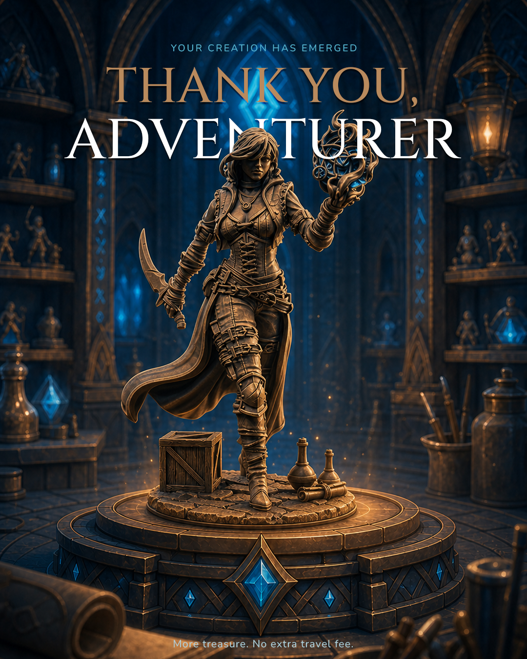
Use this layered composition whenever the printed character is unique to the order. The headline remains large and editorial, but the miniature passes in front of it to create depth without sacrificing the product focus.
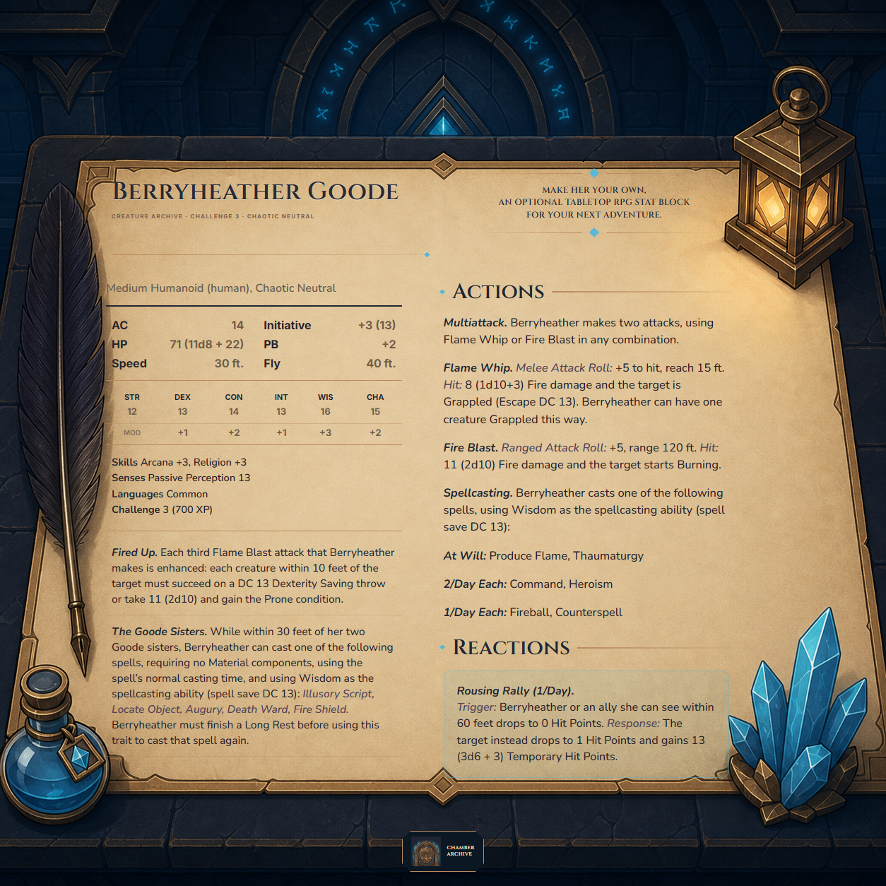
The identity should feel magical before decorative. Architecture, light, typography and one meaningful object carry the scene; components organise information rather than fill space.
The identity page is the visual source of truth. Every PNG and background can be downloaded directly from its section above.